eLearning Template re-design
INTRODUCTION
To support the learning experience for SMB and Agency oriented customers, the L&D team delivers high-quality eLearning courses.
PROBLEM
The original template didn’t provide the best visual solution to present the content (which made a poor learning experience); it was old branded and not mobile-friendly.
SOLUTION
I took the initiative and created a new template for our team. With help from the Creative Lead, I delivered a visually strong and mobile friendly template oriented to the content we build. I was able to adjust the settings inside the platform that we use and make it reusable for all team members.
RESULT
All the courses are on-brand; consistent look and feel throughout eLearning courses; different learning modality on mobile that helps to attract more users; an easy template that can be used through the team which makes the content build process faster and more comfortable;
ROLE
Visual Designer, Content Developer
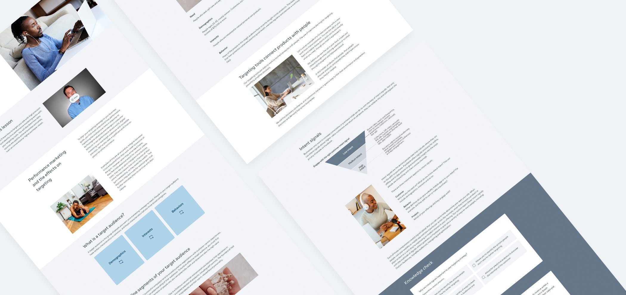
Note: This is an existing course that is a part of Buying and Planning Revamp project for Facebook. All the Visual creative assets are created by me as well.
To see this course in real life Visit the Site →
Problems
First, I identified the visual problems that original template had.
Note: solutions and results go right after problems.
Overview of original look and feel
First, let’s have an overview of real course example built with old template.
Note: the original template wasn’t built by me. However, the actual course and all the assets that you see in the course are created by me.
01
HEADER PROBLEM
The header title was not set up correctly that could cause the overlapping issue.

02
SPACING PROBLEM
The template was designed using boxes with shadows that separated the content into different pieces.

03
INCONSISTENCY
The font had inconsistent color and line-height; titles we different sizes; boxes were different sizes.

04
NOT ON BRAND
Overall, the original template's look and feel wasn't on the latest brand and needed a re-design.

Solution and Result
Overview of new look and feel
As a solution, I took the initiative to build a new template that we can use for our courses. In a team with my Creative Lead, we did a new design first, and then I implemented all the settings on the backend of our platform.
Note: This is an existing course that is a part of Buying and Planning Revamp project for Facebook. All the Visual creative assets are created by me as well.
01
HEADER SOLUTION
After multiple iterations, the solution was to split the screen by half and half. The title now goes on the left and responsive to any device size.

HEADER FINAL RESULT
Final header result on different screens.

02
SPACING SOLUTION
The Learning Designers and Content Developers must make sure that the user gets the best learning experience. That's why it is essential to think ahead about visual design. While re-designing the new template, my first idea was to get rid of the boxes with shadows on the course's main body (but to keep it in Knowledge check and the Key takeaways to make it look different from everything else).
SPACING RESULT
However, we wanted to keep some separation through articles and topics inside of one course. As a result, we decided to indicate each subject with a different background color. As a result, we got a nice course flow, which makes the learning experience better.

03
CONSISTENCY SOLUTION
It is essential to make sure that the content looks consistent within one course and throughout the learning path. I made multiple decisions to achieve these results:
First of all, from the visual standpoint, the template has the same font size and same line-height; titles all look the same; the padding and margin are the same;
I also wanted to make sure that my team is comfortable using a new style and consistent components. That’s why I created a sample course that people can duplicate and reuse in the future (with all the necessary settings);
The last thing, we needed to consider what kind of assets we use in our courses. I helped another designer create a deck, where we have instructions relevant for each type of visuals (such as photography, illustrations, animations, UI, icons, etc.) The deck includes all the necessary information about each type of asset, asset sizing, asset format, color rules, etc.

Note: The image shows the idea of sample course.
CONSISTENCY RESULT
As a result, we have very visually consistent courses. Moreover, the sample course helps Learning designers and Content Developer to create and build the content faster.


04
BRAND SOLUTION
Finally, one of the most important parts of the template was to make sure it is on-brand. The first thing you need to know is that our team represents all of the Facebook brands. It means we can’t stick with one particular color or visual but need o make sure we highlight all of them. There we multiple iterations before we got to the final destination. My first idea was to use different color blocks through the courses (but stick with one color within the course). After we tried it, we found out that it looks way too complicated. That’s how we got to the point to limit the background color to white and light grey (and dark grey for Knowledge checks to make it look different), but to use visuals that will have color.

Note: The image shows the first template iteration.

Note: The image shows the second template iteration.
BRAND RESULT
Facebook is a company with a unique visual identity. We must have all our products stick to one branding. As a result of this project, I could deliver the eLearning template that is easy to use on brand and that can be changed inside the house.
Thank for watching!